Case Study: The NCDPI Branded House
The North Carolina Department of Public Instruction is an organization whose primary responsibility is supporting the 2,500+ K-12 public schools in North Carolina. Functionally, it is the state-level equivalent of the Department of Education. It is comprised of several divisions such as the Center for Safer Schools and the Office of Career and Technical Education. Within these divisions are numerous smaller sections and teams.
In 2021, the NCDPI design team conducted an audit of our existing brand and discovered that there were more than 100 different logos in use throughout the agency.
While a few of these were created by the design team for various conferences, awards, and initiatives, we found that dozens of groups from the division level down to teams of one or two people were using their own logos, generally of unknown origin and rarely using any agency branding elements.
We prepared a presentation for the new Superintendent of Public Instruction and the leadership team demonstrating the bizarre situation. DPI was essentially utilizing a very loose House of Brands architecture. This conflicted directly with the new superintendent’s vision of a united agency.
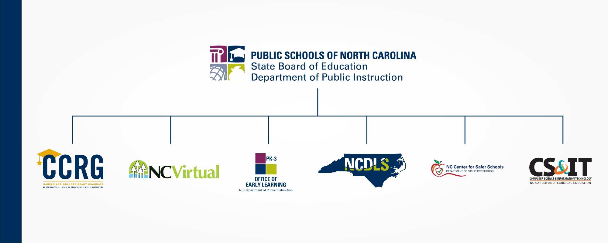
What we didn't want to wind up with was a monolithic Branded House model. The reasoning for this was two-fold. First, many of these groups were partnerships with other agencies or private institutions that had their own brand standards. Second, federally funded divisions benefit from the visual association with national organizations.
Our solution: a Hybrid Model.
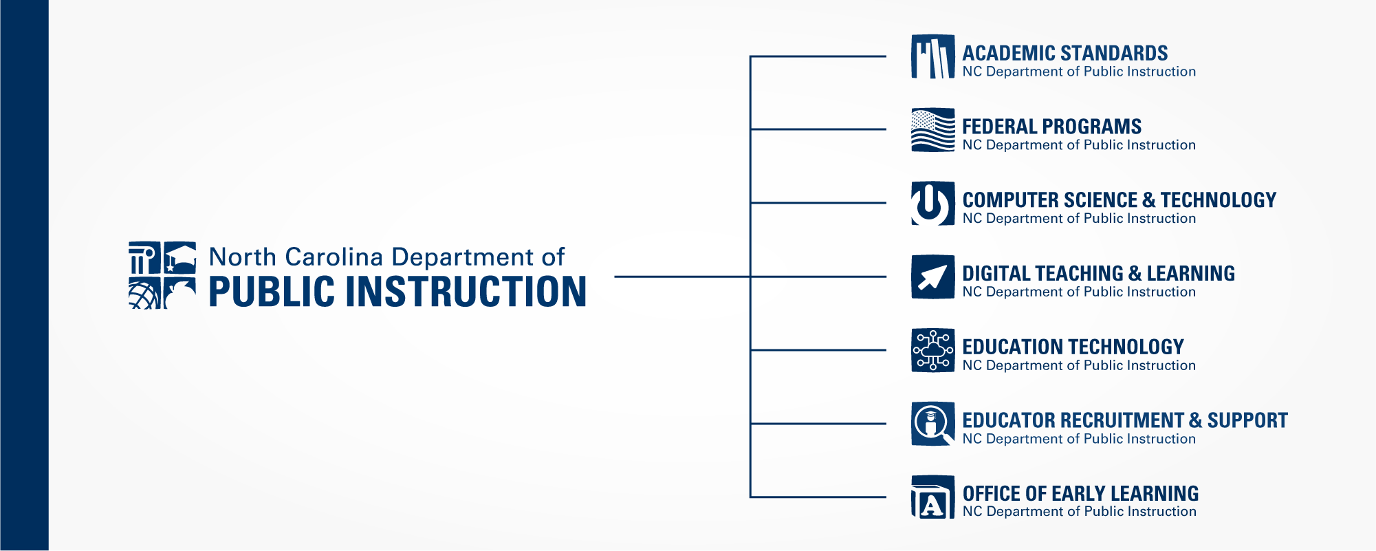
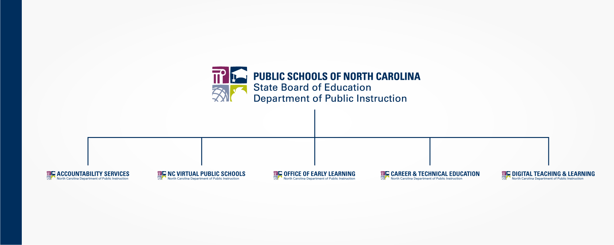
Our proposal was to make the DPI logo the primary mark for official documents and most public-facing applications, while allowing division-level groups and federally funded programs to use an additional variation of the standard logo that highlighted their unique areas of expertise. But first we had to do something about that DPI logo.
The logo at the time was created in 2012. It consisted of four blocks representing fundamental symbols of K-12 education and three lines of text. Including the multiple color variations and arrangements of its elements, there were more than 20 versions of the DPI logo in use, with no clear guidance on when to use each version. Our first task was to simplify this by eliminating the various color versions and streamlining the text.
Once this was done, we created 2-3 sample icons for each division and prepared our presentation for the directors. This included mockups of each division’s social media pages, demonstrations of proper use, and instances where the DPI brand would be more appropriate.
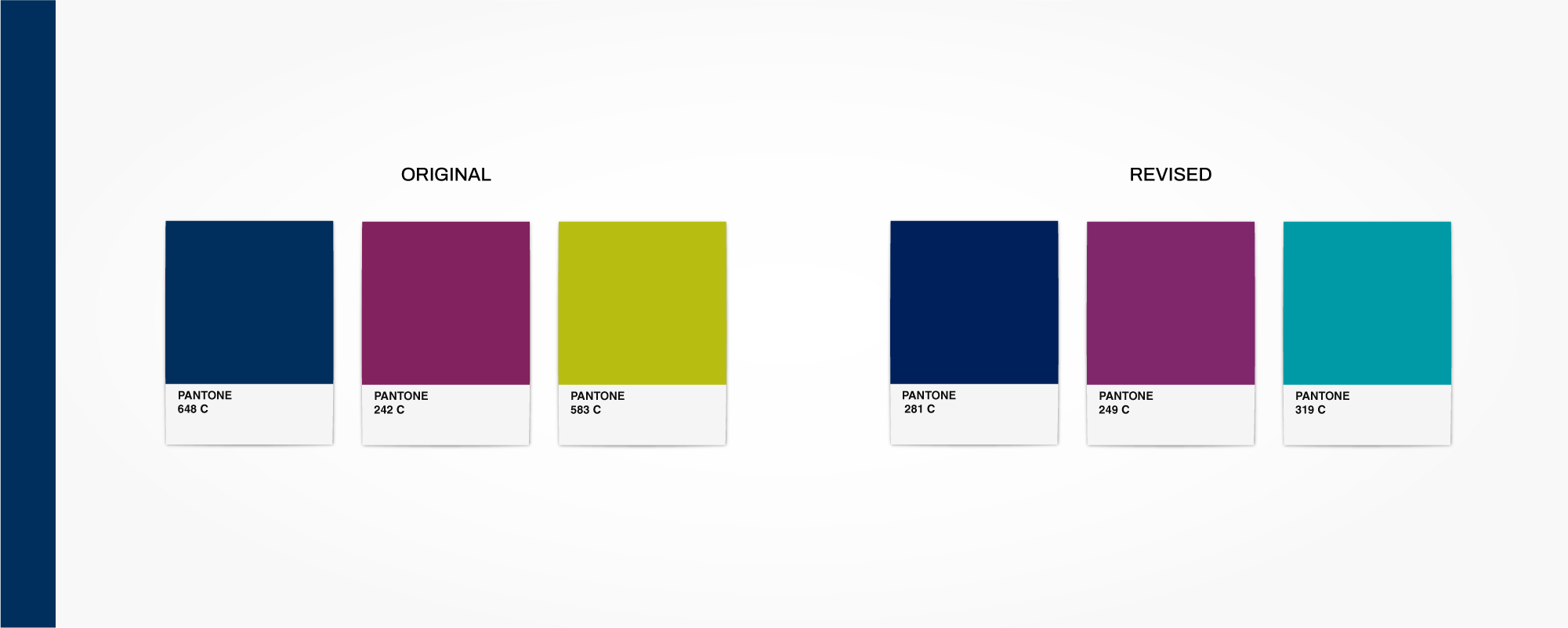
We also used this time to make some much-needed alterations to the primary and secondary color palettes after years of printing issues.
Throughout the process, we worked with division directors and agency leadership to discover why there were so many rogue logos at DPI, what we would eliminate, and what we would need to revise to fit with the new brand standards guide we were crafting in the background.
Ultimately, we narrowed it down to a horizontal and stacked version of the DPI logo, 16 division variations, and a small handful of federal and partner programs that would be able to use a modified version of their existing branding to comply with federal regulations or external partner branding. The State Superintendent and the State Board of Education approved the final brand strategy, and it was implemented mid-2021.